Updating Key Infographics to Show Proper Scale
The Atlantic Yards/Pacific Park towers, actually, are taller that previously depicted.
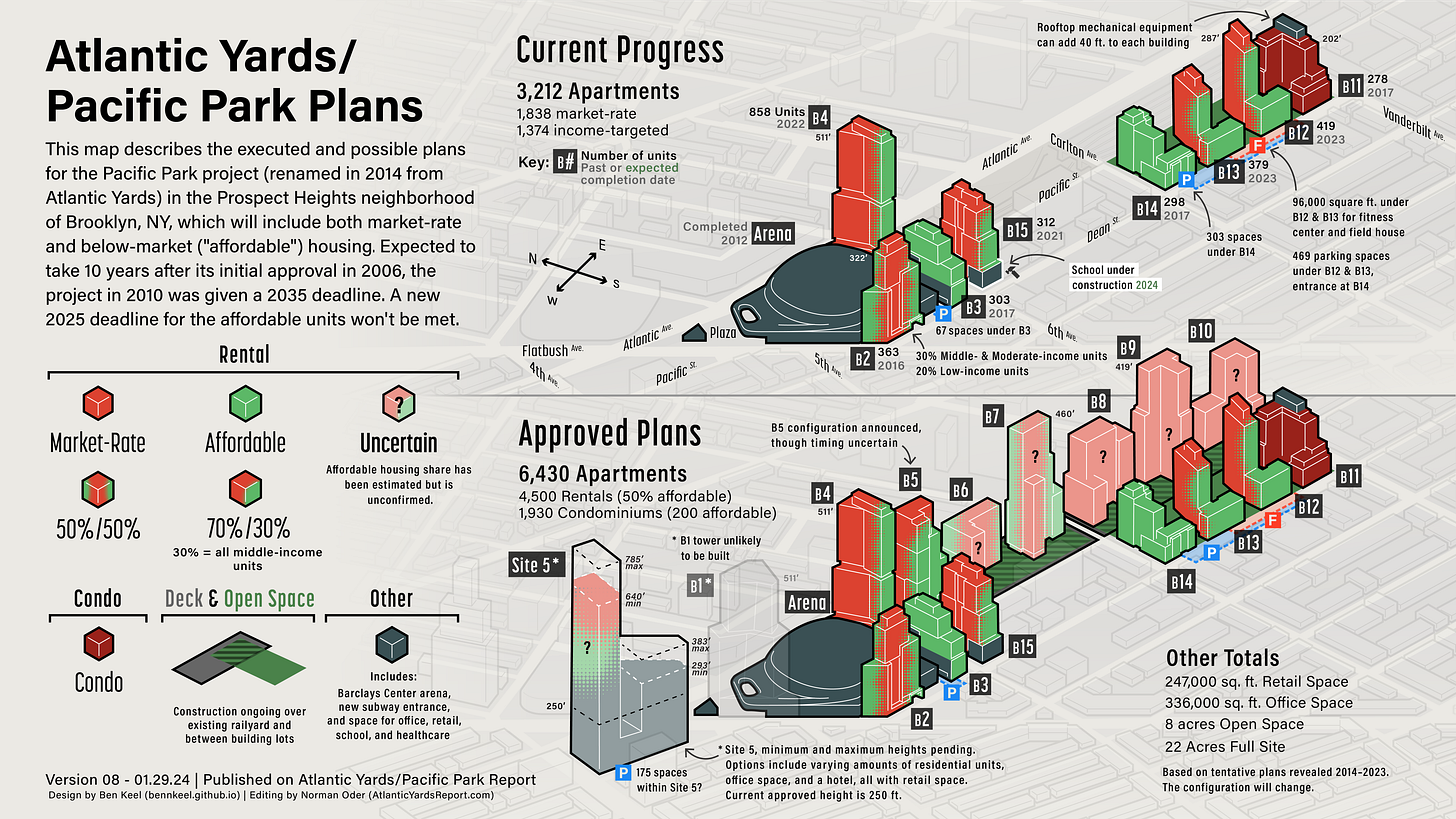
In 2017, graphic designer Ben Keel started producing a very useful infographic for me depicting the plans for and progress of Atlantic Yards/Pacific Park. (See fourth image below.)
That infographic is now on its 24th iteration. Notably, the larger image in the graphic has flipped to emphasize “Current Progress” rather than “Approved Plans.” Note the difference between the first two images below, and the two after that.
But the most important update is directly below, since it more accurately depicts the scale of the project as approved and (so far) built.
The difference, as shown in a look at the version below, from just a month ago, is the buildings are bigger. As Ben explains below, the original scale was based on a truncated ruler.
Previous versions
The version below, from January 2021, continues to use “Current Progress” as an inset, before that was flipped to be the main image. By flipping it—see above—there’s more room for details like number of parking spaces or affordability details.
The version below, from 2017, shows a more limited amount of progress.
Imperfect process
It’s an imperfect process, because the angle of the image can lead to some seeming distortions. For example, a look at the main image, below, suggests that the 287-foot B12 tower (595 Dean), near the eastern end of the site, is as tall as the 322-foot B2 tower (461 Dean), which flanks the arena.
But that’s an artifact, as Ben explains below, of the angle.
That said, it’s a far more useful graphic than, say, the map-like image distributed last week by Empire State Development, the state authority that oversees/shepherds the project.
Ownership and design
The image directly below also updates the scale of the “Ownership & Design” infographic, which debuted in 2022.
An earlier version, below, shows the buildings at smaller scale.
Below is Ben’s image of baseline building heights, noting the potential for variation at Site 5, at the far west end of the site, and signaling the “shadowy” (un)likelihood that B1 would be built.
Explaining the changes (Ben Keel)
A ruler too short
In previous versions of this infographic, the buildings were portrayed as somewhat shorter than their actual height.
The 2017 graphic was made by tracing a 3D model, where I had used a stack of cubes as a ruler to set the general height of all the buildings.
That ruler was about 30% too short compared compared to the width and depth, so all the buildings are 30% shorter than they should be. The screenshot above is an older model version, with the ruler highlighted in orange and a composite image of Google Maps and developer plan views underneath.
The original model relied on available renderings and placed the individual buildings on the base map to scale their widths and depths. Available height maximums were used to scale the buildings. Since the height ruler was about 30% too small, the width and depths of all buildings were to scale with the map, and to each other, but they were too short.
Revising the model
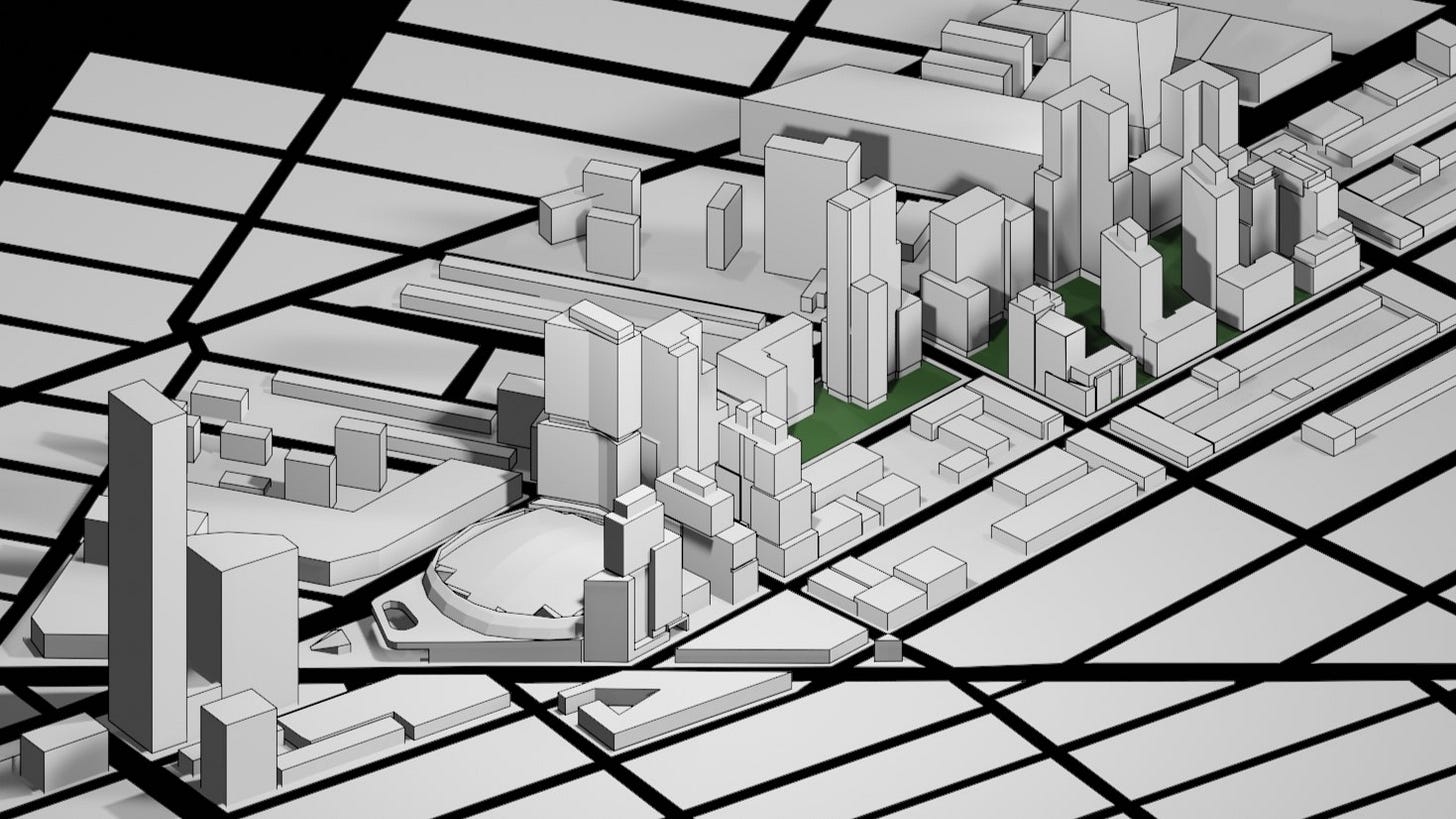
My recent work to generate perspective views of the project, showing potential future buildings along Atlantic Avenue in images and animations, prompted me to revise the model. This update, shown in isometric perspective below, uses a consistent scale across all the elements.
Also, I've cross-checked the available zoning diagrams and the most recent plan views and axon diagrams from the various developers and architects, rather than referencing earlier renderings. Going forward, viewers can be more confident in the isometric accuracy of the graphic as it is updated. Views should change, of course, when and if the development proceeds.
Setting a baseline
Note that isometric distances can be difficult to compare without a similar baseline.
So buildings in the graphic may appear taller just because they are behind or to the right of another building, even if they are shorter, especially with the graphic’s alignment to Flatbush Ave as a horizontal latitude line. In other words, B12 is not taller than B2.
To assist with the height comparison, please refer to the graphic above, which illustrates heights from a common baseline along Dean Street.
Dean Street in reality slopes slightly upward when traveling southeast—to the right in the image—but this diagram assumes a flat baseline for comparison purposes.


